
Competitive Intelligence
Background
Jungle Scout set out to empower new entrepreneurs with the insights needed to launch successful Amazon products. While our all-in-one tool excelled at helping new sellers, we struggled to attract Established Amazon Sellers—a key growth market. To bridge this gap, I led vision development and the end-to-end design of a market analysis tool that provides competitive insights, helping experienced sellers grow their business's. Over seven months, I took this feature from concept to launch, driving a strategic expansion of our user base.
My Role
I led the product design for this highly ambiguous project, which began as a product vision initiative. Collaborating closely with my manager and the Director of Product, I helped define and prioritize key use cases while owning how they would be addressed and integrated. I also coordinated across two sprint teams, ensuring a cohesive and seamless product experience.
Discovery & Insights
In 2023, the product team introduced an automated system for scheduling customer interviews, making it easier for designers, product managers, and engineering managers to connect with users. Taking full advantage of this, I spoke with numerous Established Amazon Sellers throughout the year and uncovered four key insights:
Many sellers don’t know who their closest competitors are.
They struggle to identify and prioritize their most important keywords.
While they see value in our tools, friction in setup and navigation often limits their success.
They want Jungle Scout to surface key insights automatically—telling them what data matters and why.
With these insights, the Director of Product and I mapped out customer pain points with the overarching goal of increasing revenue. From there, I outlined every step users had to take to solve these problems within the app, highlighting areas of friction.


One major issue stood out: our tools had become too siloed. Learning about a competitor’s product performance required one tool, while keyword insights required another. This fragmented experience made our platform less intuitive and less appealing to Established Sellers.

This led us to a pivotal question: What if we built a tool that centralized all of Jungle Scout’s data, with products at the core?

Problem Statement
Although Jungle Scout provides numerous valuable market insights for established Amazon sellers, many sellers are unaware of where to find or how to uncover these insights.
Defining Success
To set an aspirational target we set these experience guidlines:
Act like an assistant
Avoid overwhelming users with excessive data and assuming they will independently explore it to derive insights. Instead, emphasize key insights and essential data for our users.
Tell a story
Data is merely data until it is linked to a narrative. Assist our customers in comprehending the significance of the data, why it holds importance, and how it influences their business.
No dead ends
Strive to avoid users encountering dead ends. If you have captured their interest, offer a link for further exploration.
Time to value
Avoid imposing excessive decision-making burdens on our customers during onboarding. Enhance their experience by enabling automated setup or data filtering where suitable.
Exploration & Concept Development
To kick things off, I led a remote brainstorm to identify key themes, top customer questions, and whether we had the data to answer them. We also explored how users might set up a tool that integrated all this information.

Building on these insights, I designed user flows and wireframes, pushing the boundaries with bold concepts before refining our direction.

Our first proof of concept included:
A Competitive Performance Dashboard – After selecting a product, users automatically receive a "segment" of their closest competitors. The dashboard provides a clear view of how they compare against competitors and the market.

An Interactive Scatter Plot – This visualization allows users to identify outliers, click directly on them, and explore why certain products outperform others. Designed with "no dead ends," this feature enhances data exploration.

Keyword Analysis Tab – This tool highlights where competitors have a keyword advantage, helping sellers refine their strategy.

These designs were then tested with internal Amazon sellers and existing customers, gathering valuable feedback for iteration.
Testing & Validation
With the proof of concept complete, I led an assumption mapping session to identify what needed validation.

The assumption mapping matrix works on two axes: whether assumptions were based on strong or weak evidence and their importance to the project's success.
We prioritized testing five key areas:
Segment size
How many competitors do sellers need to track for meaningful insights?
Competition definition
How do sellers define their competitors?
Data Visualization Clarity
Do users easily interpret the graphs, or do they struggle with comprehension?
Graph Interaction Usability
Do users understand they can interact with graphs for deeper insights?
Missing Elements
What crucial features, if any, are absent?
To ensure meaningful feedback, we needed real, relevant data—generic placeholders wouldn’t cut it. My product manager and I manually built ad-hoc competitor segments using real Jungle Scout data in Google Sheets.

Here is an example of a POC built in Google Sheets based on one of our customers' products.

Here are some examples of the screens we showed our customers that included graphs directly from the Google Sheets.
We then conducted 30-minute semi-structured interviews with eight Established Amazon Sellers, each with unique business goals, to test our assumptions and refine the experience.
Key Learnings
Testing revealed several valuable insights that shaped our final design:
The scatter plot was a clear winner. Every customer we spoke to loved seeing how data points interacted. Users instinctively tried clicking on the dots—validating our plan for interactivity without the need for further testing.

Scatter plot graph highlighting the user's product (ASIN) against each competitor.
Benchmarking against the segment average wasn’t useful. Sellers preferred direct competitor comparisons over broad averages, which they found too vague and uninspiring.

This is a line graph comparing the user's product's weekly revenue to the average revenue of all the competitors' products within the segment.
The box-and-whisker chart caused confusion. While users appreciated the attempt to show data distribution, each person interpreted it differently, leading to misunderstandings.

Each tile here contains a box-and-whisker chart. The line horizontal line represents the entire spread of the data. The thicker grey box indicates where 50% of the data points land within that spread.
Refining the Visualizations
The biggest change was replacing the box-and-whisker chart. Revisiting my original designs, I explored new concepts and ultimately landed on a single-axis scatter plot.

Here is an example of different versions I tested and some of the inital findings.
This visualization better conveyed the competitive landscape, allowing users to quickly recognize their own product, understand its position, and compare it with competitors. When tested, sellers grasped the insights instantly—confirming it as the right choice.

Here are the tiles with the new single-axis scatter plot chart I ended up moving forward with.
Post Launch Iterations
After launching Competitive Intelligence in July 2024, we quickly gathered user feedback. One key insight stood out: while the top section of the overview dashboard was useful at first, its value diminished over time. Users wanted a clearer way to track changes, saying, "It’s a great snapshot, but it’s hard to know what has changed since I last visited."

Here is a screenshot of the launch version of the overview tab. The top section highlighted the user's product and showed their product's market share over the selected time range. In this case, 12 months.
To address this, I redesigned the top section to provide a historical view, making it easier for sellers to track the impact of their listing and marketing changes over time.

Here is the changed top section with an improved historical view of the user's Market Share.
Outcome
Our goal was to attract more Established Amazon Sellers—and we succeeded. In the first three months post-launch, we exceeded our net acquisition target by 142%.

Additional UI Screens
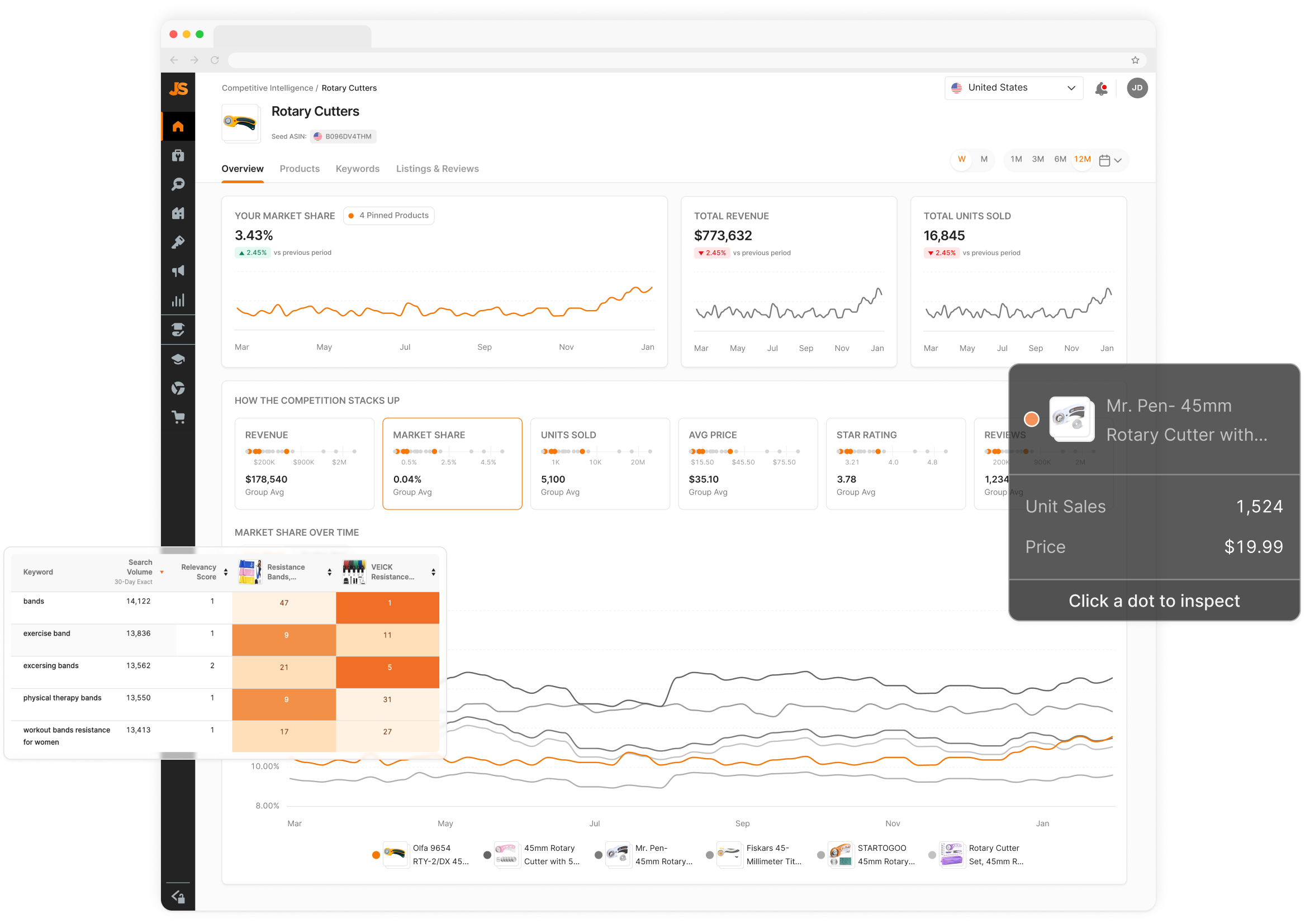
The Competitive Intelligence project was extensive. Here are additional screenshots of the final UI, showcasing sections not covered above.

This is the hover state interaction when a user is investigating their Market Share.

Anden Leesley designed the Keywords tab and experience. My role on this page was to provide feedback and direction, ensuring we created a connected and consistent experience throughout each tab within Competitive Intelligence.

The Listings & Reviews tab would allow users to compare their product's listing against 4 other products. This would enable our users to gain insights into the listing quality and missing image types and use our AI review analysis to assess what customers say about each product within the reviews. I was the lead designer on this tab.
